Showing posts with label XM Cloud Component Builder. Show all posts

Friday, 25 October 2024

Exploring XM Cloud Component Builder: Show Dynamic Content

October 25, 2024 0

In my previous blogs on XM Cloud, I covered how to create and display static data using the component builder, as well as how to style and build different versions of a component. In this post, I'll focus on creating a dynamic data source for components.

Dynamic content enables components to be flexible and reusable across different contexts. Content such as text, images, videos, and links can be populated from various sources, like CMS content, APIs, or a GraphQL URL.

Components are composed of elements such as buttons, cards, or other components, and each element can have a data source assigned to it. There are two primary options for displaying content within a component:

  1. Static - You can define static content for an attribute, such as entering alt text for an image or uploading an image directly.
  2. Mapped - You can map the attribute to dynamic content (text, image, or link) from a data source previously added to your XM Cloud environment. This dynamic content can be used multiple times within a single element, even from different sources. It’s also possible to mix static and dynamic text within one text element by combining regular text with variables.

Creating Data Source Content for a Component

When using an XM data source within a component, rather than defining a specific content item to map data, you create a template representing the data you want to insert into the Sitecore component. Later, once your component is staged and used in the page builder, you can assign a compatible content item based on this template.

Steps to Prepare an XM Data Source in Components

  1. Open the Content Editor.
  2. Create a new template, for example, in Templates/Feature/Webinar.


  3. In the content tree on the left pane, navigate to sitecore/Content/Site name/Site name/Settings.
  4. In the Site configuration section, locate FEAAS component data source templates and select the template(s) you want to add to the component builder, making them appear in the right-hand field.


  5. Click on the templates in the Content Editor to make them available as data sources within Components.
  6. Click Save.
  7. Go to Components, and on the Data sources tab, you’ll see the new XM data source listed among the available data sources.

Mapping Data from an XM Data Source to a Component

To map data from an XM data source to a component:

  1. Add an element to the component, or select an existing element.
  2. In the right-hand pane, go to the Content section, and click the attribute you want to configure for the selected element. For example, with an Image element, you can configure attributes such as Image source, Caption, Alternative text, or Link using mapped data.
  3. Select Mapped to open the Data collection dialog.


  4. In the Source step of the dialog, choose the appropriate XM data source from the drop-down list.


  5. In the Path step, the data tree will show relevant properties that can serve as values for the attribute. Click the desired property for the attribute.


  6. Click Complete to finish the mapping process.

Adding an External Data Source in XM Cloud Components

In the Components builder, mapping data to a component helps the component recognize the structure of an external data source. By using a sample JSON structure, you can teach components to interpret data accurately.

To add an external data source to XM Cloud Components:
  1. Go to the Data Sources tab and click Add Data Source.
  2. Enter a unique name and description for the data source.
  3. To populate the data source field with structured sample data, choose one of the following options:

    • Paste raw JSON: Paste raw JSON data directly.
    • Fetch from URL: Enter the URL endpoint from which to retrieve the data and click Fetch.
    • GraphQL: Enter the GraphQL endpoint URL and click Fetch.

  4. The data will be retrieved along with any key-value pairs in Params, Header, or Body sections and displayed as a tree on the right.
  5. Once the data tree reflects the correct structure and fields, click Save to complete adding the data source.


Adding a Data Source in XM Cloud Components via the Content Editor

You can also use the Content Editor to add a data source in XM Cloud Components.

To add a data source:

  1. In the Content Editor, navigate to the Settings folder of the site where you want to add the data source.
  2. In the editor view, under Site Configuration, locate the FEaaS component editor script URL field and paste the URL of your data source.


Mapping Data from an External Data Source to a Component


To map data from an external source to a component:

  1. Add a new element to the component, or select an existing element.
  2. In the Content section of the right-hand pane, choose the attribute you want to configure for the selected element. For instance, an Image element can be mapped to attributes like Image source, Caption, Alternative text, or Link.
  3. Click Mapped to open the Data collection dialog.
  4. In the Source step of the dialog, select the relevant data source from the drop-down menu.


  5. In the Path step, the data tree will display the available properties that can serve as values for the attribute. Select the appropriate property for the attribute.

  6. When the data source contains multiple records of the same object and Data scope > Data collection is set to Mapped, the dialog will include a third step called Items. Here, you can specify how the data should be repeated when setting up a repeater for the element:
    • All: Repeat the element for every item in the data source collection.
    • Limit: Repeat the element only for the first items in the collection.
    • Specify: Choose specific items to repeat based on their position in the list.
     7.  After setting up the repetition, you can preview in the component's canvas to see how it will                  appear based on the selected data source.
      8. Finally, click Complete to finish the mapping.

Below are the two important practice you should do-

Defining a Fallback for Missing Mapped Data

You can set a fallback strategy for cases when the data source mapped to an attribute is unavailable. Follow below steps to define fallback data:

  1. In the Components builder, select the attribute you want to assign a fallback to.

  2. In the Content section on the right pane, click Fallback.

  3. Based on your fallback strategy, choose one of the following options:

    • Nothing – Leaves the element visible, even with the missing attribute.
    • Hide – Hides the entire element.
    • Show fallback – Displays specified static text, an image, or a link in place of the missing data.
  4. If you select a fallback option, enter the fallback content in the designated field. For images, specify a default image URL.


Updating a Data Source

When a remote data source is updated, the version added to XM Cloud Components does not automatically fetch these updates. If the data source has changed, you’ll be prompted to fetch the latest data. To update a data source:

  1. Go to the Data Sources tab and select the data source that needs updating.
  2. In the JSON section, click Fetch.


References: Adding dynamic content to a component 

Wednesday, 23 October 2024

Exploring XM Cloud Component Builder: Create Versions

October 23, 2024 0


In my previous blog, I discussed how to style a component, modify elements, and customize themes. In this post, I'll focus on creating different versions of a component.

In XM Cloud Components, a component can have multiple visual representations, known as component versions. These versions allow us to personalize components for specific audiences in Pages. Additionally, versions and breakpoints can be used to create responsive bundles, enabling components to adjust their appearance based on screen width.

Adding a Version to a Component

To add a new version to a component:


  1. In the Components Builder, scroll to the bottom of the page and click Add version.
  2. If this version is intended for responsive design, specify the breakpoints at which it should be displayed.

Duplicating a Component Version

Once you've styled and configured a component, you can duplicate it to easily create versions with different layouts without starting from scratch.
To duplicate a component version:


  1. In the Component Builder, click Actions at the top-right corner of the component.
  2. Select Duplicate version.
  3. The duplicated version will appear below the original component.

Deleting or Archiving a Component Version

To delete a component version:


  1. In the Components Builder, click Actions on the version you wish to remove.
  2. Click Delete.

If the version has been staged or published, it will be archived instead of deleted, allowing for future restoration.


To restore an archived version:

  1. Scroll to the bottom of the component versions to locate the archived versions.
  2. Click Show archived versions.
  3. Click Unarchive on the version you wish to restore.

Working with versions for responsive design

To create different renderings for various screen sizes, you need to create a new version for each size. You can speed up this process by duplicating an existing version. Any adjustments made to a specific version will apply across all the selected breakpoint sizes.


Steps to Create a Version for a Defined Breakpoint or Group of Breakpoints:

  1. In the Components Builder, duplicate the component by clicking Duplicate version as many times as needed to create the required versions.
  2. For each version, click Breakpoint settings.
  3. Select the breakpoint(s) you want to assign to that version. You must choose at least one breakpoint from the drop-down menu. For example, you can create a version called Mobile devices for the extra small and small breakpoints, one called Tablets for the medium breakpoint, and one called Desktops for the large, extra large, and extra extra large breakpoints.

Default Breakpoints Available:

  • Extra Extra Large: More than 1400 px
  • Extra Large: 1200 px to 1400 px
  • Large: 992 px to 1199 px
  • Medium: 768 px to 991 px
  • Small: 576 px to 767 px
  • Extra Small: Less than 576 px

Responsive bundles


  1. Once you have completed the designs, click Stage above each version you wish to include in the bundle. Alternatively, to stage all versions of the component at once, click outside of the versions to open the Overview pane on the right-hand side, then select Stage all.


  2. To ensure the correct breakpoints are assigned to the right versions, go to the Overview pane and click Default bundle in the Responsive bundles section. If necessary, you can assign different versions to specific breakpoints by selecting the appropriate version from the drop-down list. Note that only staged versions designed for the relevant breakpoints will be available to select.


  3. If you want specific versions to be available as stand-alone components in Pages (without using a responsive bundle), go to the Overview pane. In the Specific versions section, click Available versions in Pages, then select Allow to use as a specific version.
  4. To use the responsive bundle or a specific version in a webpage, go to Pages and drag the component into the desired placeholder. In the right-hand pane, select either the responsive bundle or the specific version you want to use. If you are using a custom page builder, you can also click Get the embedding code to use the component.


In my upcoming blog, I’ll discuss about the how to manage data source for components.


Monday, 30 September 2024

Exploring XM Cloud Component Builder: Add Styling To Your Component Part 3

September 30, 2024 0


In my previous blog, I discussed on how to apply rules to the elements and how to implement theme. In the current blog, I'll discuss on Style a component, an elements and customize the theme.

In XM Cloud Components, themes are managed in the Styles builder, allowing you to apply them to components with a single click.

In a previous blog, I explained that themes consist of pre-built elements and style rules, designed to simplify the styling process by applying multiple styles at once.

How to Style a Component Using a Theme:

  1. In the Components library, select the component you want to style.
  2. In the Components builder, locate the version you want to style and click Current theme in the top-right corner.
  3. In the right-hand panel, under the Themes tab, select the theme you wish to apply.
  4. The component will now be styled according to the chosen theme.


Customizing a Theme

You can tailor a theme by selecting alternative styles for certain categories of elements. This is possible only if the theme includes pre-configured alternatives to the default styles. You can access these alternative styles by clicking the right arrow in the theme picker.

To customize a theme for a specific component version:

  1. In the Components builder, select the version you wish to customize.
  2. In the top-right corner, click Current theme.
  3. In the right-hand panel, click Customize.
  4. Select the right arrow for the element type you want to modify.
  5. From the Allowed styles list, choose the style for that element type within the component.
  6. Customized styles are highlighted in light green in the Element customization overview.

Please note: The customization only applies to the current theme and component version. Changing the theme will remove all customizations, and they won’t be transferred to other components or versions using the same theme.

Styling a Single Element and Text

In XM Cloud Components, elements are assigned one or more styles from the Styles library. When an element is used in a component, it automatically adopts the default style assigned in the Styles library.

Styling a Single Element

You can modify the style of a specific element within a component without altering the style of all similar elements in the component.

To style an individual element:


  1. In the Components builder, select the element you want to style by either clicking it on the canvas or using the context toolbar in the bottom-left corner of the component.
  2. In the right-hand pane, at the top of the Style section, click the style tile.
  3. To choose a new style for the element, click the top tile.
  4. In the drop-down menu, select one of the following options:
    • Current theme: Access the styles allowed by the currently applied theme.
    • All available: Access all available styles for the element, even those not assigned to the current theme.
  5. Click on the desired style to apply it to the selected element.

The element will now be styled according to the chosen style, either from the current theme or from any other allowed styles in the Styles library.

You can also detach the element from the current theme and choose a style from the All available list. If the theme is modified, an orange tag with a warning icon will appear next to its name. Further customization is possible through one-off adjustments.

Styling Text

You can style text by making inline edits or applying style rules defined in the Styles library.

To style text:

  1. In the Components builder, highlight the text you want to style.
  2. To change the text style:
    • In the right-hand pane, under the Style section, click the tile to open the Styles picker and select a different style for the text.
    • To the left of the highlighted text, click the dropdown and select one of the Text element tags. The styles associated with these tags are predefined in the Text blocks of the Styles library.
  3. To adjust text alignment, open the Text settings under the Alignment section in the right-hand pane.

Customizing an Element

Elements are assigned one or more styles in the Styles library. When used in a component, the element is styled based on the theme selected for that component. However, you can change the default style by selecting a different style from the Styles library or other available styles.

Customizing a Style

To customize a style by modifying one or more features:


  1. In the Components builder, select the element you want to style by either clicking it on the canvas or using the context toolbar in the bottom-left corner of the component.
  2. At the top of the right-hand pane, under the Style section, click the tile to open the Styles picker and select the style you want to customize.
  3. To modify a specific feature of the style (e.g., Typography or Spacing), click the relevant option.
  4. Enable the "Show all available styles" option to view all styles built in the Styles builder. You can choose from additional styles assigned to the element or select any style from the library, even if not originally assigned. Note that using extra options will detach the style from the original element, indicated by a warning icon.

Creating a One-Off Customization of a Style

To create a one-off customization by configuring one or more features of a style:

  1. In the Components builder, select the element you want to style by clicking it on the canvas or using the context toolbar in the bottom-left corner.
  2. At the top of the right-hand pane, under the Style section, click the tile to open the Styles picker and choose the style you wish to customize.
  3. Select the feature of the style you want to modify (e.g., Typography or Spacing).
  4. Click the options menu (three dots) and choose Custom.
  5. The right-hand pane will display the configuration settings from the Styles builder, allowing you to create a one-off custom design.

In my upcoming blog, I’ll discuss about the how to manage version for components.


Saturday, 28 September 2024

Exploring XM Cloud Component Builder: Add Styling To Your Component Part 2

September 28, 2024 0


In my previous blog, I discussed on how we can add basic style and rules in Sitecore XM Cloud Components style library. In the current blog, I'll discuss on how to apply rules to the elements and how to implement theme.

Applying Style Rules to Elements in XM Cloud Components

Once you have added the basic styles (colors, fonts, graphics, and breakpoints) to your Styles library and bundled them into style rules, you must specify which style rules can be applied to specific elements. This ensures that only on-brand and curated style options are available in the Styles library, which will be used in the Components builder. Custom CSS styles can also be added to elements for greater flexibility.


Add a Text Element Style

Text elements come with six default collections: Heading 1, Heading 2, Heading 3, Heading 4, Heading 5, and Paragraph. Each text element is automatically assigned the corresponding HTML tag (e.g., adding a text element from the Heading 1 collection assigns an <h1> tag).


To add a text element style:

  1. In the Styles builder, click Text elements in the left pane.
  2. Click Add style (+ icon) for the type of text element you want to add.
  3. Enter a name for the text element.
  4. On the Typography and Color tabs, select the styles you want available for this text element.
  5. Optionally, add custom CSS in the Custom CSS tab.
  6. Click Save.

Add an Inline Element Style

Inline elements include links, buttons, and badges.


To add a style to an inline element:

  1. In the Styles builder, click Inline elements in the left pane.
  2. Scroll to the type of inline element you want to style.
  3. Click Add style.
  4. Enter a name and optionally a description for the style.
  5. On the Typography, Spacing, Decoration, Fill, and Text color tabs, select only the styles you want for the inline element.
  6. Optionally, add custom CSS in the Custom CSS tab.
  7. Click Save.

Add a Block Element Style

Block elements include sections, cards, block quotes, and image blocks. Sections are typically top-level blocks (like full-width panels), while cards are nestable boxes within sections that frame content visually.


To add a style to a section or card:

  1. In the Styles builder, click Block elements in the left pane.
  2. Scroll to the element type you want to style.
  3. Click Add style.
  4. Enter a name for your block element.
  5. On the Fill, Decoration, and Spacing tabs, select only the styles you want to apply to this block element.
  6. Optionally, add custom CSS in the Custom CSS tab.
  7. Click Save.

Create Custom Inline and Block Elements

By default, inline elements come with Buttons, Badges, and Links collections, while block elements come with Sections and Cards collections. You can also create custom inline or block elements tailored to your project.


To create a custom block or inline element:

  1. In the Styles builder, click Add custom type in the top-right corner.
  2. Enter a name for your custom element.
  3. Click Save.


Themes in XM Cloud Components

Creating themes is the final step in building an atomic styles library within XM Cloud Components. Themes are composed of a combination of elements and style rules you've already defined. Their purpose is to streamline the styling process by allowing multiple styles to be applied at once—for example, applying a light section, dark card, and light text block with a single click.

How to Add a Theme


To add a theme to your style library:
  1. In the Styles builder, click Themes in the left pane.
  2. Click Add theme.
  3. Enter a name for your theme.
  4. Navigate to the Block elementsInline elements, and Text elements tabs.
    • For each tab, add the appropriate styles for the various elements.
    • For example, in the Block elements tab, click Add section to add a style for sections, and select the desired rules from the drop-down menu.
  5. You can assign multiple styles to each element. If you assign more than one style, choose a default style for the element.
  6. Click Save to add the theme to the Styles library.

In my upcoming blog, I’ll discuss about the how to apply these style in components.

Thursday, 26 September 2024

Exploring XM Cloud Component Builder: Add Styling To Your Component

September 26, 2024 0


Welcome back to our XM Cloud Component Builder series blog. In my previous blog of this series I discussed about how to create a component using XM Cloud component builder. In this blog we will begin with understanding what the Sitecore XM Cloud Components style library.

The Styles library and builder of XM Cloud Components is a design system that manages the styles of all components and their versions and ensures visual consistency across all your digital properties. 

Define basic styling:

In XM Cloud Components, style design begins with defining the basic category, which includes fonts, colors, graphics, and breakpoints.


Fonts:

You can define and select fonts to maintain consistency and readability across your website.


To add a font to the Style library, follow these steps:

  1. In the Styles builder, click Fonts in the left pane.
  2. At the top of the page, click Add font library.
  3. In the Font type field, choose either Google or Custom fonts based on your requirements. For custom fonts, you can upload them using the Fetch remote CSS file option.
  4. I'll select a Google font family from the drop-down menu, then choose the relevant font.
  5. Select the desired font styles by checking the boxes under each style option.

Colors:

You can add the colors you want to use for your brand. It is recommended to create collections and organize colors within them for better maintenance and consistency.


To create a new color collection:

  1. In the Styles builder, click Colors in the left pane.
  2. At the top of the page, click Add collection.
  3. Add with unique collection name and save.

To add a color to a collection:

  1. In the desired color collection, click Create.
  2. Assign the color a unique class name and confirm which collection it belongs to.
  3. Click the color input field (e.g., HEX or RGB) and enter the color value.
  4. Adjust the opacity as needed.
  5. Click Save.

Graphics

Defining graphics in the Styles Library ensures that all visual assets, such as logos and icons, are used consistently across your website. This helps maintain User Experience, Brand Consistency, and Optimized Graphics.

It is highly recommended to create collections and organize graphics within them for better management.


To create a new graphic collection:

  1. Navigate to the Graphics tab in the left Styles menu.
  2. Click Add collection at the top right corner of the page.
  3. Name your new graphic collection and click Save.

To add a graphic to a collection:

  1. In the desired graphic collection, click Create.
  2. Assign the graphic a unique name and confirm which collection it belongs to.
  3. Paste the image or icon URL.
  4. Click Save.

Breakpoints:

You can create custom breakpoints for your website and organize them into collections. Breakpoints are sorted from the largest to the smallest within each collection, helping you manage Responsive Design and User Experience effectively.


To create a new breakpoint collection:

  1. In the Styles builder, click Breakpoints in the left pane.
  2. Click Add collection.
  3. Assign a unique name to your collection.
  4. Click Save.

To add a breakpoint to a collection:

  1. In the desired breakpoint collection, click Create.
  2. Name the breakpoint (e.g., Large for big screens, Medium for tablets, or Small for mobiles).
  3. From the drop-down menu, select the collection the breakpoint belongs to.
  4. Enter the pixel values for when the breakpoint starts and ends. Ensure that breakpoints do not overlap, as this can cause issues with responsive components on a webpage.
  5. Click Save.

Style rules

In Sitecore XM Cloud Components, you can build style rules to extend design primitives and apply them to elements. Rules such as Typographies, Decorations, Fills, and Spacing utilize the basics (fonts and colors) you've previously added to the Styles library. You can also incorporate custom CSS styles into these rules.


Typographies:

Typographies are extensions of fonts with defined sizing for each font type.


To create a new typography collection:

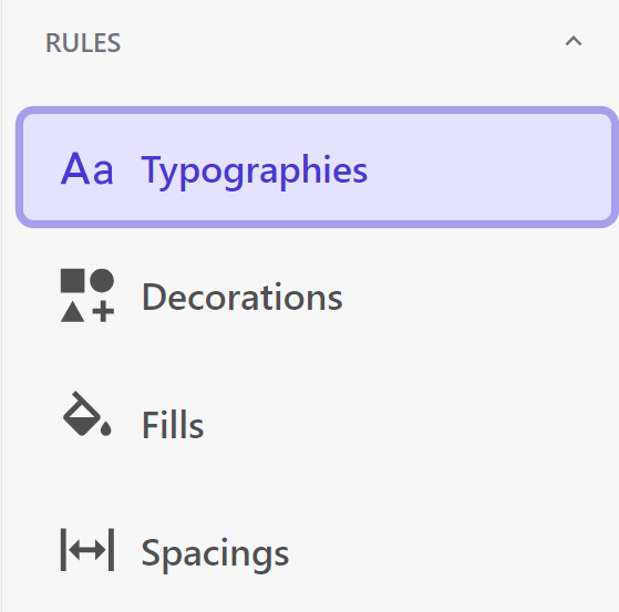
  1. In the Styles builder, click Typographies in the left pane.
  2. Click Add collection.
  3. Assign a unique name to your collection.
  4. Click Save.

To add a new typography:

  1. In the desired typography collection, click Create (+ icon).
  2. Enter a name for the typography (e.g., Article headline).
  3. On the Font type tab, select a font (only Google fonts are available).
  4. On the Settings tab, configure values for font size, line height, letter spacing, paragraph spacing, icon size, and case style. Set these values independently for different breakpoints.


  5. Click Save to add the typography to the Styles library.

Decorations:

Decorations allow you to add visual accents like borders and drop shadows to elements and blocks.


To create a new decoration collection:

  1. In the Styles builder, click Decorations in the left pane.
  2. Click Add collection.
  3. Assign a unique name to your collection.
  4. Click Save.

To add a new decoration:

  1. In the desired decoration collection, click Create (+ icon).
  2. Enter a name for the decoration.
  3. On the Corner radius tab, define rounded corners for elements and blocks.
  4. On the Drop shadow tab, configure shadows for elements and blocks.
  5. On the Border tab, add borders or border shadows to elements and blocks.
  6. Click Save to add the decoration to the Styles library.

Fills:

Fills allow you to add background colors or gradients to cards, buttons, or sections.


To create a new fill collection:

  1. In the Styles builder, click Fills in the left pane.
  2. Click Add collection.
  3. Assign a unique name to your collection.
  4. Click Save.

To add a new fill:

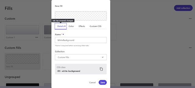
  1. In the desired fill collection, click Create (+ icon).
  2. Enter a name for the fill and select the collection it belongs to.
  3. On the Color tab, choose a previously defined color or create a gradient with options for the gradient angle and color opacity.
  4. On the Effects tab, set the blur intensity and opacity for the fill.
  5. Click Save to add the fill to the Styles library.

Spacing:

Spacing defines grid arrangements such as padding and gaps for layout components.


To create a new spacing collection:

  1. In the Styles builder, click Spacing in the left pane.
  2. Click Add collection.
  3. Assign a unique name to your collection.
  4. Click Save.

To add a new spacing rule:

  1. In the desired spacing collection, click Create (+ icon).
  2. Enter a name for the spacing.
  3. On the Spacing tab, define padding and gap values in pixels, percentages, em, or rem. Choose from the following options:
    • Sync: Makes all padding and gap values the same.
    • Sides (Vertical/Horizontal): Combines top and bottom or horizontal padding values.
    • All custom: Customizes padding and gap values for top, right, bottom, left, vertical, and horizontal spaces.
  4. It’s best practice to set values for all three configurations to easily choose the one you need in the Components builder.
  5. Optionally, add custom CSS.
  6. Click Save to add the spacing rule to the Styles library.

In my upcoming blog, I’ll discuss about the how to apply rules to the elements and how to implement theme.