In my previous blog, we discussed about the basic terminology of Sitecore XM Cloud. In this blog post, we will discuss about different components available in Sitecore XM Cloud and how we can use out of the box component in a page.
Components are serves as fundamental elements of a page
structure which are used to display content and can conveniently edit visually.
Page layout configuration of a page determine the position of the component.
There are various types of components that can be utilized
in XM Cloud:
OOTB Components: There are out of the box (OOTB) components
available in Sitecore XM Cloud pages. Those are categorized into Commerce,
Media, Navigation, Page Content, and Page Structure groups.
Sitecore Components: Designers can create components in XM
Cloud Components and prepare them for use in XM Cloud Pages. These components
can display static or dynamic content. Data source can be internal, external
including Content Hub ONE. They can be configured using the settings in the
right-hand pane and styled with themes created in XM Cloud Components Styles.
When adding a Sitecore component to a webpage, you can choose to use a specific
version or a responsive bundle, which adjusts the component based on the screen
size.
SXA Components: Developers can build these components in the
Content Editor and save them. These components are them available in content
tree under components and can drag and drop onto a webpage in XM Cloud Pages.
SXA components can incorporate static content from Explorer, the Sitecore media
library, or Content Hub ONE. They can be further configured using the settings
in the right-hand pane.
BYOC Components: Bring your own components, here developers
can integrate their own code by referencing an external code base that includes
components.
Forms: Designers can create forms in XM Cloud Forms to
easily send data to third-party applications without capturing user data.
All these components are available in XM Cloud Pages, where you can effortlessly drag them onto the editor canvas to add them to a webpage layout.
Below are the steps to create a new page and add component
to the page:
Adding a new Page
- Navigate to the Pages tab in the left-side menu in Sitecore
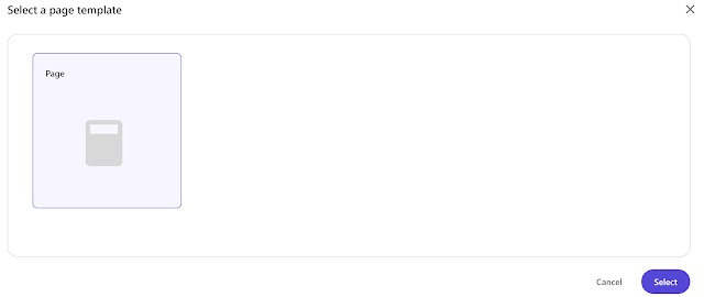
XM Cloud Pages and click + Create a page.
- Choose the Blank Page template from the dialog box, and
click Select.
- Name your new page in Sitecore XM Cloud Pages.
Adding Components to a Page
- The new page will have the basic layout that consists of
the site title, main placeholder, footer placeholder. Let's add two columns to
this page
- Navigate to the Components tab in the left-side menu and
choose the component to add to the page. In this example we will use an Image
component under the Media section.
- Let's add another component Rich Text to the page.
- Select the component you want to edit, and a menu will
appear on the right side of the Pages editor. Here you will find the different
component options such as layout, styling, and advanced styling details.
- Once done, publish this page.


No comments:
Post a Comment